kheoos: When Chaos Meets Order
The name “kheoos,” intriguing and unique, has roots in a history as rich as it is meaningful. This bold choice reflects both a strategic vision and a creative approach, grounded in the industrial experience of its founder. Let’s delve into the story behind this name, where chaos meets order, and where the visual identity aligns with the company’s mission.
Inspiration from Chaos
To understand the origin of “kheoos,” one must go back to a time when the company’s founder faced a common challenge in the industrial world: managing maintenance parts.
During his early experiences with this issue, he quickly discovered a minefield of inconsistencies. The databases were a veritable labyrinth devoid of meaning: buyers placed orders relying solely on mysterious codes, often without knowing what they actually represented. The result? A flood of duplicates, saturated storage spaces, and equipment catalogs that seemed to stretch endlessly without ever overlapping.
These dysfunctions made any meaningful analysis impossible: no statistics by brands or machines, no opportunities to improve processes, and no ability to compare purchase prices across sites. Maintenance teams and buyers, isolated in their respective silos, ended up speaking two completely different languages, amplifying misunderstandings.
On top of that, the consequences were far more severe: frequent production stoppages, recurring tensions between teams, and a general sense of chaos. This disordered and inefficient situation left such an impression on the founder that it became the inspiration for the company’s name.
A name full of meaning
However, while this “chaos” played a role in the genesis of the project, the term could not reflect the company’s ambition. It carried a negative connotation, incompatible with the vision embodied by “kheoos”: transforming disorder into opportunity and bringing clarity and coherence where none existed.
This led to a subtle play of transformations: the “c” became a more dynamic “k,” the “a” morphed into an “e,” and the “o” was doubled, creating a unique and memorable word. Thus, “kheoos” was born, symbolizing a positive reinvention and a quest for efficiency in the service of industry.
A Design That Tells a Story
The double “o” in “kheoos” is much more than a simple spelling feature. It forms a central element of the company’s visual and symbolic identity. When these two letters are represented as a horizontal “8,” several powerful ideas emerge:
- Infinity (∞): A timeless symbol that reflects the idea of continuity and durability, echoing “kheoos’s” mission in resource reuse.
- Recycling (♻): The company’s activity is rooted in rediscovering and repurposing unused parts, giving them a second life through the kheoos market platform.
- Collaboration (🤝): Represented by the interconnection of circles, this highlights the importance of relationships between industries to create a sustainable value chain.
These multiple meanings add an extra layer of depth to the name, linking both its written form and its mission.
The origin of the name "kheoos": a story of chaos... and a cat?
At the very beginning, to avoid any confusion or negative association with chaos, a whimsical idea was proposed: to claim that “kheoos” originated from the name of the founder’s cat. Yes, a cat! A funny anecdote that could have made this feline an unofficial mascot of the company. Unfortunately (or fortunately), this version was quickly debunked – the cat in question didn’t even bother to confirm the story.
Today, we fully embrace this initial reference to chaos. But beware, it’s a chaos that has been revisited and reinterpreted: far from evoking confusion, “kheoos” embodies the idea of transforming disorder into opportunity, a positive repositioning that reflects our mission.
The name “kheoos” and the logo were created even before the official establishment of the company in 2018, highlighting how important a strong and cohesive identity has always been. These founding elements symbolize the vision and values that drive us, with a little touch of feline irony to boot.

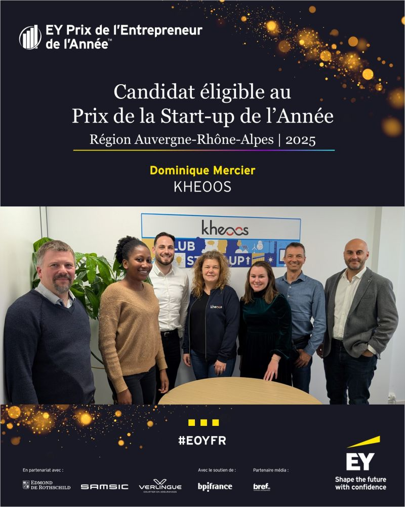
Dominique Mercier
Founder et CEO
A Universal and Adaptable Name
Another key aspect in choosing “kheoos” was its ability to adapt to the various facets of the company’s offerings. Short, unique, and easy to remember, the name can be combined to create distinct and clear labels such as “kheoos market,” or “mykheoos” This flexibility ensures immediate recognition while reflecting the diversity of services offered.
Moreover, the uniqueness of the company name, brand, and domain name strengthens its digital identity—an indispensable element in an increasingly connected world.
A Well-Assumed Quirk
One deliberate and playful detail: “kheoos” is always written with a lowercase “k.” This stylistic choice, aligned with the logo, adds an aesthetic and distinctive touch. It reflects the meticulous attention to detail and a desire to stand out in even the smallest aspects.
Conclusion: An Identity Anchored in Balance
“kheoos” is much more than a name. It embodies a philosophy: transforming chaos into order, restoring usefulness to what seemed lost, and creating lasting connections between industries. Every element of its name and logo tells this story and supports its mission. By adopting a strong and coherent identity, “kheoos” has built a universe where innovation and sustainability come together to shape a better future.
With “kheoos,” sell your dormant inventory, find rare and obsolete maintenance parts, and give a new life to maintenance parts destined for destruction.